By Karlie Shoffner
They say to never judge a book by its cover—an expression that can be especially true in its literal sense—but sometimes it’s difficult to abide by this rule. Some covers are just so beautiful and so unique that they immediately capture your attention and make you want to read what’s inside without first checking what exactly the book is about. I know I’m guilty of doing this. These four books grabbed my attention with their covers and kept a hold of it because their actual content inside sounded interesting, too.
My Best Friend’s Exorcism by Grady Hendrix

Hendrix’s horror novel is about a girl named Abby who is convinced that her best friend Gretchen has become possessed by a demon. After years of being inseparable, Abby suddenly finds her friend behaving differently and decides the only reasonable explanation is demonic possession. This book’s cover pulled me in because it has been designed to look like a VHS cover. The book is set in the 80s, and the cover captures the nostalgia of popular horror movies from the decade.
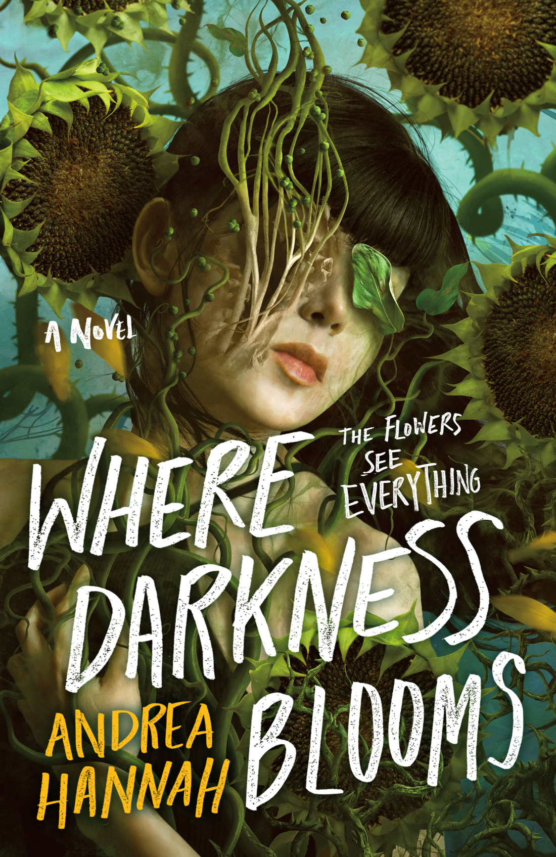
Where Darkness Blooms by Andrea Hannah

The fictional town of Bishop is one full of mystery, known especially for its high number of missing women. The occurrences have become such a norm that cases are never deeply investigated and are always closed as soon as they begin. Three women’s mothers become victims of the disappearances that plague this town, and the trio struggles with their desire to both repress the event and investigate the secrets that are appearing before them. The cover for this novel left me intrigued because I wanted to know more about why there was such a great number of flowers added to the cover. I could tell by the cover alone that the story was going to be one of horror and mystery, two genres I always enjoy reading.
Scorched Grace by Margot Douaihy

Sister Holiday finds herself in the middle of an arson investigation in this novel. Determined to bring peace back to her newfound sanctuary, Sister Holiday decides to put the investigation into her own hands. In the process, though, she must return to her past, one that is checkered and seems unexpected for someone who has found herself working as a nun. The stained glass artwork featured on the cover drew me to this novel. Combined with the title of the novel and the nun on the cover smoking a cigarette, I wanted to know more about this character and find out for myself about her sketchy past.
We Had to Remove This Post by Hanna Bervoets

Bervoets explores the darker side of social media and the people who work to keep harmful content off it. Kayleigh and her colleagues work as moderators for a social media site and daily are faced with horror-filled, hateful content that they must sift through and remove. As time progresses, Kayleigh’s colleagues begin to break down, and the conspiracy theories they read daily begin to feel a bit too true. Kayleigh begins to question their work and if they’ve been burdened with too much. While the cover of the novel doesn’t seem to tell a story like the other covers, I still felt intrigued by it. It’s bright and reminds me of a broken computer screen. Even such a simple image like that still manages to encapsulate what the book will be about, and it made me want to explore the world in this novel more.
While many readers try to not judge a book by its cover, sometimes this is seemingly impossible. Some covers are just too good and too irresistible, leaving the contents inside only a second thought. Behind each interestingly covered book, though, is a story that is just as interesting, as proven by these four novels.


